The Institute for Health and Evaluation at the University of Washington in Seattle recently produced a time-based visual representation of the causes of death broken down by cause and area. Even if you’re not a research geek, like me, you can easily spend hours mining the data and each time you look you discover another story, not just about yourself but about where we still have some real work to do both in terms of our focus at home but more importantly in the developing world. While these observations are fascinating and please feel free to feedback your own, I want to broaden the discussion to the rise of this sort of data and what it represents.
Death by info-graphic
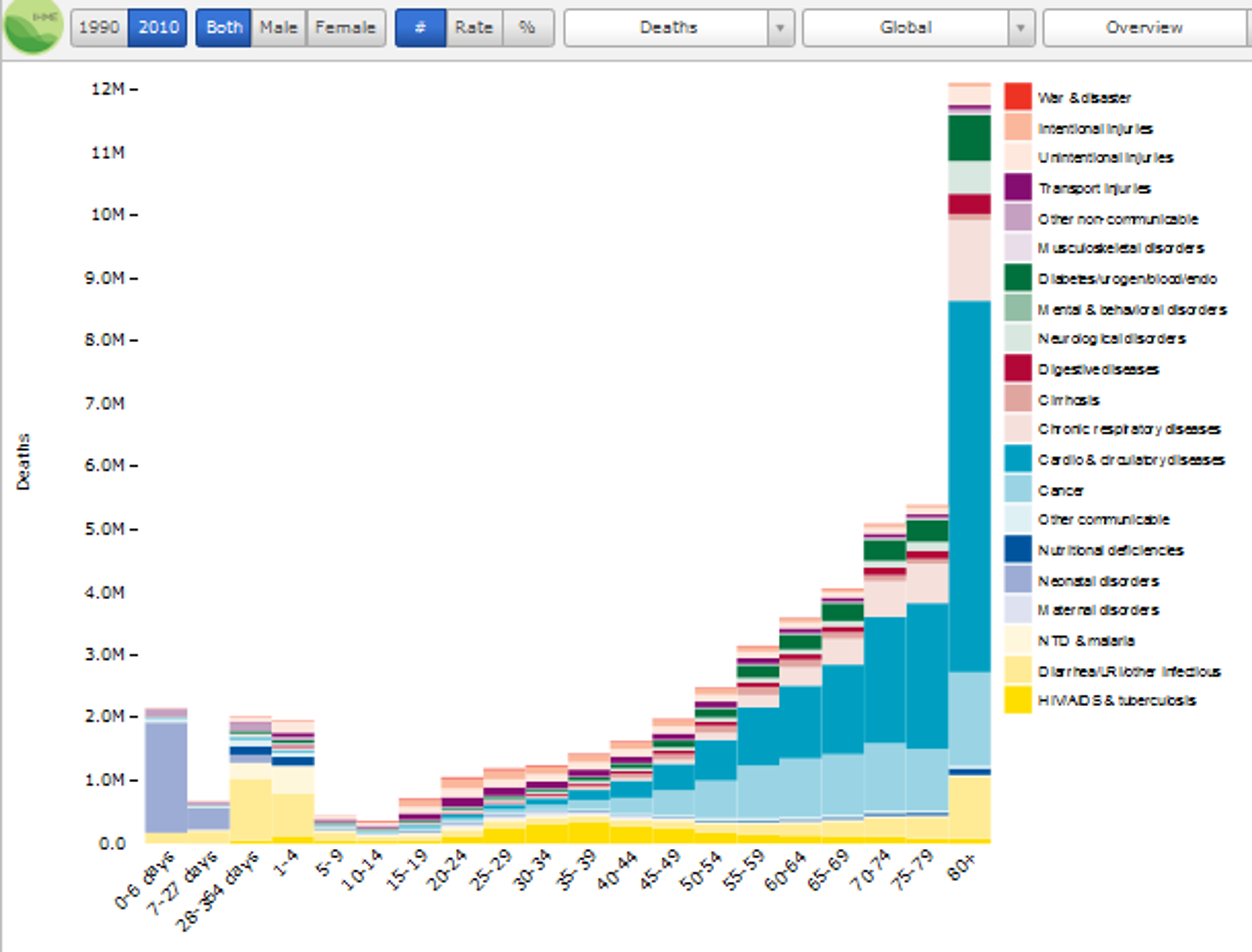
The Causes of Death graph is an illustration of the rising phenomenon of graphical representation of vast quantities of data. As is often said: “A picture is worth a thousand words”. With this in mind the appetite for info-graphics, information visualisation software, geo-visualisation and mash-ups continues to grow unabated. Hans Rosling’s development of the Gapminder Trendalyzer for instance, has offered a new way of looking at correlations of health, economic, and development, and other pertinent human data across all regions of the globe over the last century up until modern day. By doing this, global trends and developments on the ground can be analysed in terms of their direct impact on a number of relevant benchmarks. Rosling himself points out how you can now use the software to identify the huge bump in life expectancy caused by the invention of penicillin. This is something we have all assumed but it garners particular strength when presented graphically.
Will you sink or swim in the sea of data?
This should also be viewed in the context of what has been described as ‘big data’ - the current technological buzzword that encompasses the vast quantity of data both official and user-generated that is being accumulated through the web. For instance in 2011 alone some some 1.8 zettabytes of data will be created, according to a new IDC Digital Universe study, equal to 57.5bn 32GB Apple iPads. This means data volumes are doubling every two years – faster than Moore’s Law. Indeed, many commentators now predict a time when all policy as well as elements of journalism, think wikileaks, will come from the ability to mine and analyse that data in an appropriate way. Does this mean that database engineers will become the new Gods or does it pave the way for a new wave of analytical tools? Either way we are even more at the mercy of the machines.
The hidden truth
While presentation of large quantities of data in a single image or graph makes them much more ‘consumable’, relying on them too much comes with a warning. This is particularly true when the data is being used in decision-making processes and particularly in policy-making. Academics have described this aggregation of data as the ‘data iceberg’ (see Jesringhaus amongst others for details on this) where only the top line figures are viewable, while the complex web of information that makes up the aggregated data is hidden. In terms of the QALY data, it appears to highlight areas that would warrant policy or NGO focus but unfortunately on its own offers no explanation of the context, causes or anomalies that have produced this data. With policy-makers’ time particularly precious there is a danger that this kind of aggregated data will be presented as telling the whole picture, ultimately leading to misdirected policy that attempts to affect the results rather than the underlying causes.
However this take nothing away from the power of this tool. Already people are gaining new perspectives on what areas of intervention require investigation. At the same time new data tells previously unknown stories about what people have to be aware of as individuals in terms of their own health. The data also highlights how lucky we are in the West and how much work has got to be done to address the inequalities in death rates between countries, gender and age. The other stunning fact is how many people die of avoidable causes. Surely the provision of clean water and of the basic necessities to all as well as the extension of Western drugs and healthcare globally can make a huge difference in balancing these figures?
A final thought: Looking at the data provides a little window into our own mortality. Ultimately one day we will be at the bottom of this ‘data iceberg’.